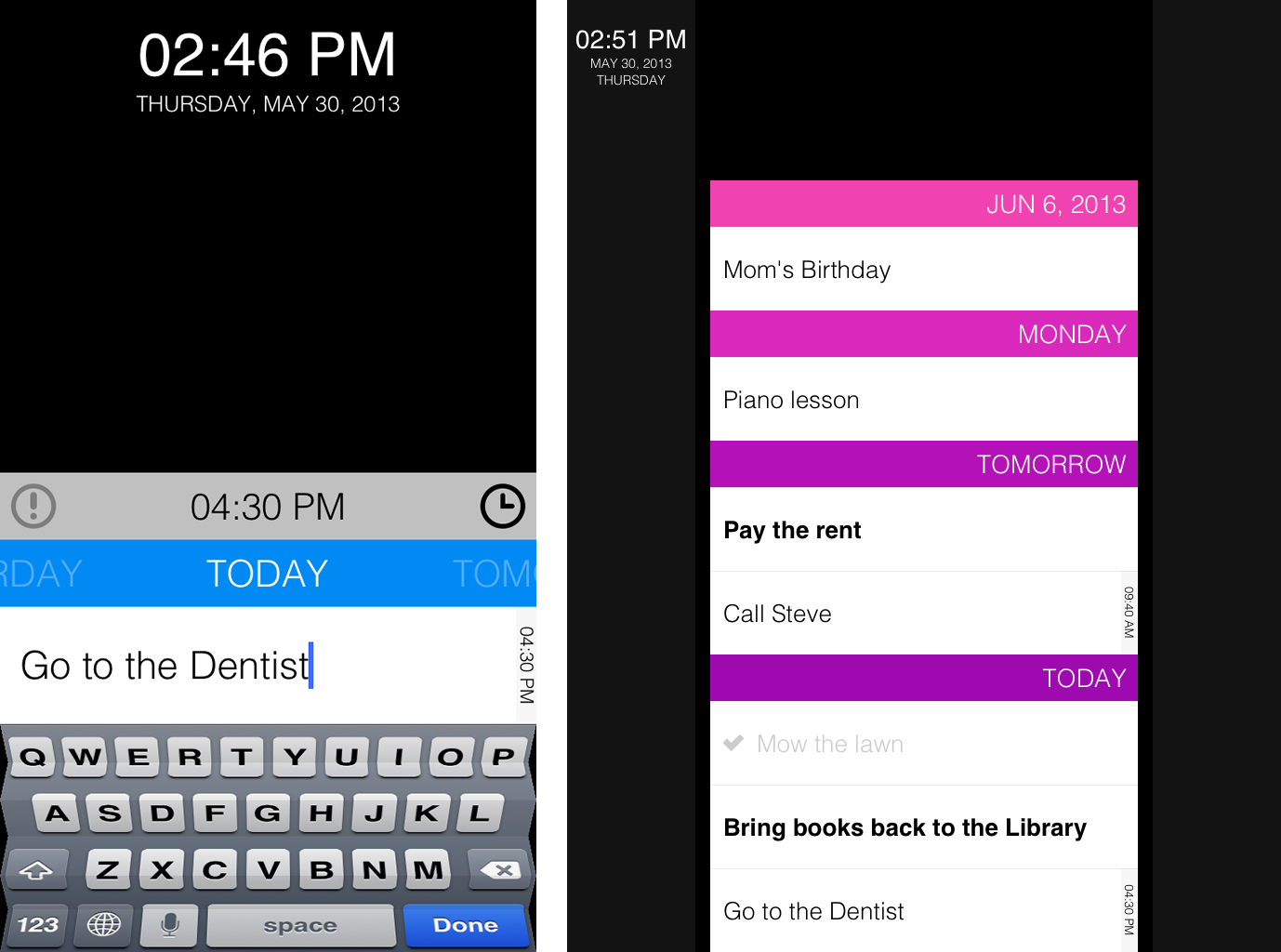
Task is a calendar app while Clear is a to-do list app
→ Cet article est traduit en français
After Task was released, in June 2012, several blogs compared it with Clear, released a few weeks before. Indeed, we thought that Clear's gestures would become common in the future so we decided to use them in Task. And we were right, just like the well-known Pull-to-Refresh — introduced by Tweetie — these gestures are now a part of the interaction language of iOS. It is important to understand that Task is more a calendar app than a to-do list app. Besides, with Task, we have introduced many innovative features in order to rethink the calendar on mobile devices. And we have improved these features with Task 2. This major update is the opportunity for us to emphasize our contribution.


Our goal with Task is to make the use of a calendar on iPhone as simple and common as the use of the Messages or Twitter app. These two applications are fast and focused on a single main task. That is why it is possible to text or tweet in less than 5 seconds, even while being mobile (meeting, public transportation, etc.).
We cannot say the same about the existing calendar apps. Apple provides two apps to achieve almost the same goal: Calendar and Reminders. They Both have a classic, inefficient interface. For example, editing the date of an entry in Calendar requires six steps. As for the third party apps, they focus too much on advance features (geolocation, labels, tags, etc.) which is not good in a mobile context.


In Task, a task is necessarily short in order to force users to be synthetic, which is the first step to speed up the process. No tag, no label, no additional comment. Just a 120-character text. Historically, text messages were limited to 160 characters (charged) and tweets are still limited to 140 characters. The success of those services is bound to this limitation.
There are several ways to create a new task, to face different situations:
Our pinch gesture implementation is particularly smart: there are several ambiguous cases (pinching two tasks apart, two days apart, etc.) but we succeeded to make it so that users can seamlessly create a task at a desired location because it behaves as they expect.
The same kind of ambiguity occurs when dragging a task: let's say there are two sections, Monday and Wednesday. What if one user wants to move a task at the bottom of the Wednesday section? The task could be due Wednesday or Tuesday. Again, we have found a smart solution: a gesture-based menu appears when one user moves a task to an ambiguous location.
Adding and editing a task have to be fast so the entry form must be efficient. Considering that most users will most likely want to manage short-term tasks, we have designed a linear date picker which allows to find a close date quickly. Of course, for distant dates, it is always possible to unfold a full calendar.
With Task 2, we have improved the management of the past tasks: unlike the future tasks, past tasks can pile up. Therefore, scrolling to a particular date after many months of use might be hard. That is why we have imagined an archive mechanism: only the past seven days are displayed in the timeline. The older tasks are grouped by months.
The iPad interface is quite similar to the iPhone one, except for margins around the timeline. This way, we were able to keep the visual identity of Task as well as making the iPad (mini) easier to handle (thin bezels) while using it.

This extra space allowed us to display the current date all the time on the iPad version. On the iPhone, it wouldn't have been possible to do so because it would have made the interface too heavy. We have hidden the current date at the top of the screen and it can be revealed by pulling on the timeline. We find this solution both elegant and efficient.

One more thing: the direction of the timeline. A lot of users asked us to display the tasks due today at the top of the screen. This would mean reversing the timeline direction. We say no. A timeline must display future at the top and past at the bottom. Because Task is mainly used to manage future events, displaying today at the bottom of the screen makes perfect sense: it allows to see what you have to do while keeping a logical and understandable order.
Designing Task was a very interesting exercise. We began to think about this app in 2011, released its first version in 2012 and used it for a year before working on Task 2. In fact, you can even see the old Task as a prototype of this amazing new version. Every aspect of Task 2 is based on a long-term experimentation and extensive reflexion. I think we did it: Task is the perfect task management app :)


Task is a calendar app while Clear is a to-do list app
Our goal with Task is to make the use of a calendar on iPhone as simple and common as the use of the Messages or Twitter app. These two applications are fast and focused on a single main task. That is why it is possible to text or tweet in less than 5 seconds, even while being mobile (meeting, public transportation, etc.).
We cannot say the same about the existing calendar apps. Apple provides two apps to achieve almost the same goal: Calendar and Reminders. They Both have a classic, inefficient interface. For example, editing the date of an entry in Calendar requires six steps. As for the third party apps, they focus too much on advance features (geolocation, labels, tags, etc.) which is not good in a mobile context.


In Task, a task is necessarily short in order to force users to be synthetic, which is the first step to speed up the process. No tag, no label, no additional comment. Just a 120-character text. Historically, text messages were limited to 160 characters (charged) and tweets are still limited to 140 characters. The success of those services is bound to this limitation.
There are several ways to create a new task, to face different situations:
- A pull to create a task due today.
- A pinch between two items to create a task at a given location.
- A tap above/below the timeline.
- A tap on a day header ("Today", "Tomorrow", "Saturday", etc.).
Our pinch gesture implementation is particularly smart: there are several ambiguous cases (pinching two tasks apart, two days apart, etc.) but we succeeded to make it so that users can seamlessly create a task at a desired location because it behaves as they expect.
The same kind of ambiguity occurs when dragging a task: let's say there are two sections, Monday and Wednesday. What if one user wants to move a task at the bottom of the Wednesday section? The task could be due Wednesday or Tuesday. Again, we have found a smart solution: a gesture-based menu appears when one user moves a task to an ambiguous location.
Adding and editing a task have to be fast so the entry form must be efficient. Considering that most users will most likely want to manage short-term tasks, we have designed a linear date picker which allows to find a close date quickly. Of course, for distant dates, it is always possible to unfold a full calendar.
With Task 2, we have improved the management of the past tasks: unlike the future tasks, past tasks can pile up. Therefore, scrolling to a particular date after many months of use might be hard. That is why we have imagined an archive mechanism: only the past seven days are displayed in the timeline. The older tasks are grouped by months.
The iPad interface is quite similar to the iPhone one, except for margins around the timeline. This way, we were able to keep the visual identity of Task as well as making the iPad (mini) easier to handle (thin bezels) while using it.

This extra space allowed us to display the current date all the time on the iPad version. On the iPhone, it wouldn't have been possible to do so because it would have made the interface too heavy. We have hidden the current date at the top of the screen and it can be revealed by pulling on the timeline. We find this solution both elegant and efficient.

One more thing: the direction of the timeline. A lot of users asked us to display the tasks due today at the top of the screen. This would mean reversing the timeline direction. We say no. A timeline must display future at the top and past at the bottom. Because Task is mainly used to manage future events, displaying today at the bottom of the screen makes perfect sense: it allows to see what you have to do while keeping a logical and understandable order.
Designing Task was a very interesting exercise. We began to think about this app in 2011, released its first version in 2012 and used it for a year before working on Task 2. In fact, you can even see the old Task as a prototype of this amazing new version. Every aspect of Task 2 is based on a long-term experimentation and extensive reflexion. I think we did it: Task is the perfect task management app :)
20 juin 2013